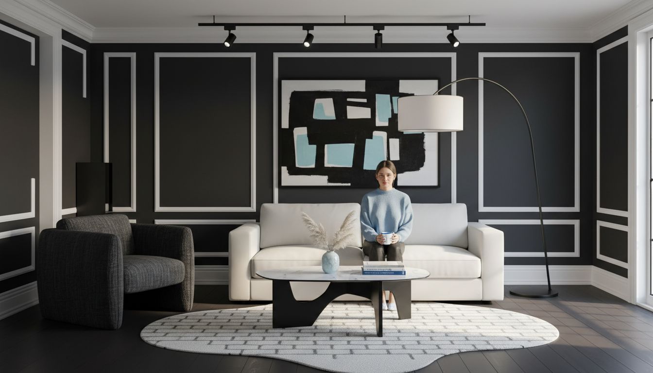
A room with high contrast catches the eye in an instant. Over 60 percent of designers report that bold contrasts can make a space feel more dynamic and memorable. People crave interiors that spark excitement and energy, but effortless style takes more than pairing black and white. Understanding how to blend colors, textures, and shapes helps you transform dull spaces into vibrant, striking rooms that leave a lasting impression.
Table of Contents
- Defining High Contrast Interior Design
- Core Principles And Visual Effects
- Selecting Tiles For High Contrast Spaces
- Applying High Contrast Design In Key Areas
- Common Mistakes And Design Pitfalls
Key Takeaways
| Point | Details |
|---|---|
| High Contrast Design | A design strategy that utilizes significant differences in color, texture, and shape to create visually compelling spaces. |
| Core Principles | Key elements include chromatic contrast, textural opposition, and spatial dynamics, which enhance visual impact and emotional response. |
| Tile Selection | Choosing tiles involves pairing contrasting colors, textures, and patterns to define areas and engage viewers effectively. |
| Common Mistakes | Avoid overwhelming contrasts, ensuring balance and intentionality to create cohesive, curated designs rather than chaotic spaces. |
Defining High Contrast Interior Design
High contrast interior design is a bold and dynamic approach to creating visually striking spaces that capture immediate attention. Contrast isn’t just about color—it’s a sophisticated design strategy that leverages dramatic differences in elements to generate visual excitement and depth. According to Oklahoma State University Extension, this technique involves “the use of starkly differing colors, textures, and shapes to create visually compelling and easily distinguishable spaces.”
At its core, high contrast design is about intentional juxtaposition. Designers achieve this by strategically pairing elements that have significant differences—think deep black against crisp white, rough textures beside smooth surfaces, or angular furniture placed near organic shapes. Hostos Community College Guides emphasizes that this approach “emphasizes the juxtaposition of elements with significant differences in color, texture, and form to create dynamic and engaging environments.”
The key principles of high contrast interior design include:
- Utilizing opposite color values (light vs. dark)
- Combining contrasting textures (smooth vs. rough)
- Mixing geometric and organic shapes
- Creating visual tension through deliberate spatial arrangements
- Establishing clear visual hierarchy within a space
Understanding high contrast design requires recognizing it as more than just a visual trick. It’s a nuanced approach to creating spaces that feel intentional, energetic, and visually compelling. By thoughtfully selecting and arranging elements with significant differences, designers can transform ordinary rooms into extraordinary experiences that engage and inspire.
Core Principles and Visual Effects
High contrast interior design is fundamentally driven by strategic principles that transform spaces from ordinary to extraordinary. According to Federal Highway Administration, the core principles include “balance, contrast, and scale,” which collectively guide the arrangement of elements to achieve visual harmony and dynamic spatial experiences.
The visual effects of high contrast design are profound and multifaceted. Architecture Courses notes that these design principles “affect the emotional and psychological responses of occupants, enhancing the overall design impact.” By deliberately playing with opposing visual elements, designers can create spaces that feel simultaneously bold and harmonious.
Key visual principles in high contrast design include:
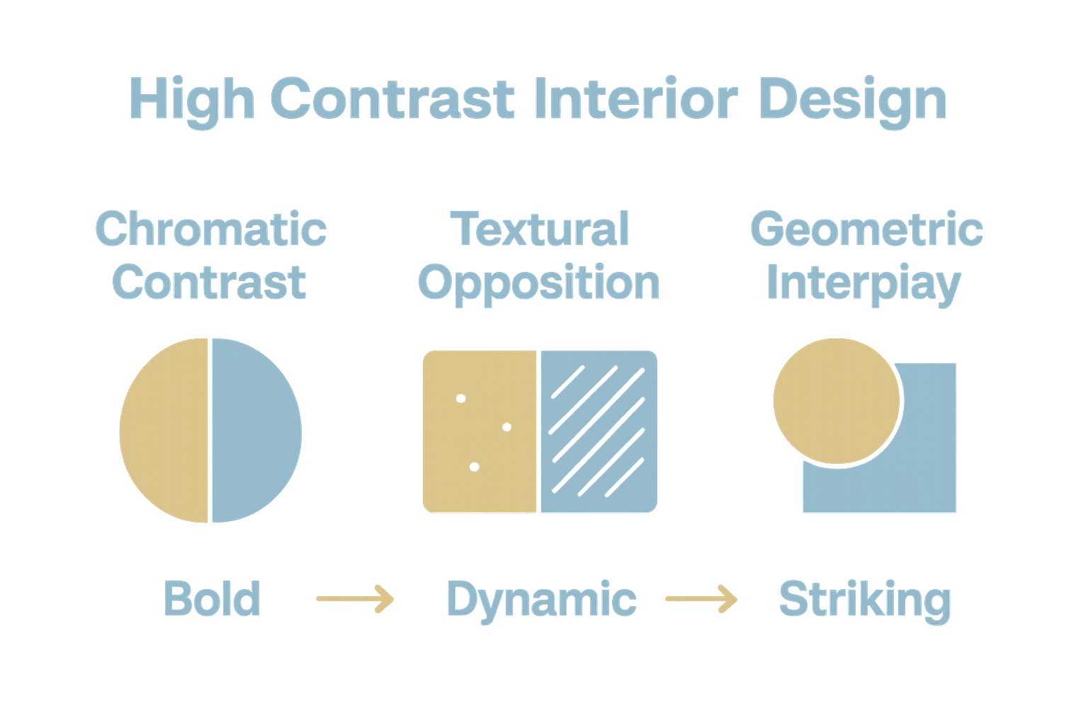
Here’s a summary of key principles and their visual effects in high contrast interior design:
| Principle | Description | Visual Effect |
|---|---|---|
| Chromatic Contrast | Use of light vs. dark colors | Bold focal points |
| Textural Opposition | Mixing smooth and rough surfaces | Enhanced depth and tactility |
| Geometric Interplay | Combining angular and organic shapes | Dynamic visual movement |
| Spatial Dynamics | Strategic placement of contrasting elements | Greater sense of dimension |
| Luminosity Variation | Balance between light and dark zones | Dramatic spatial hierarchy |
- Chromatic Contrast: Using dramatically different color values
- Textural Opposition: Combining smooth and rough surface treatments
- Spatial Dynamics: Creating depth through strategic element placement
- Geometric Interplay: Mixing angular and organic shapes
- Luminosity Variation: Balancing light and dark zones
Mastering high contrast design requires a nuanced understanding of visual tension. It’s not about creating chaos, but about orchestrating deliberate visual relationships that guide the viewer’s eye and create compelling spatial narratives. Successful designers use these principles to transform rooms from mere functional spaces into dynamic, emotionally resonant environments that tell a story through their visual composition.
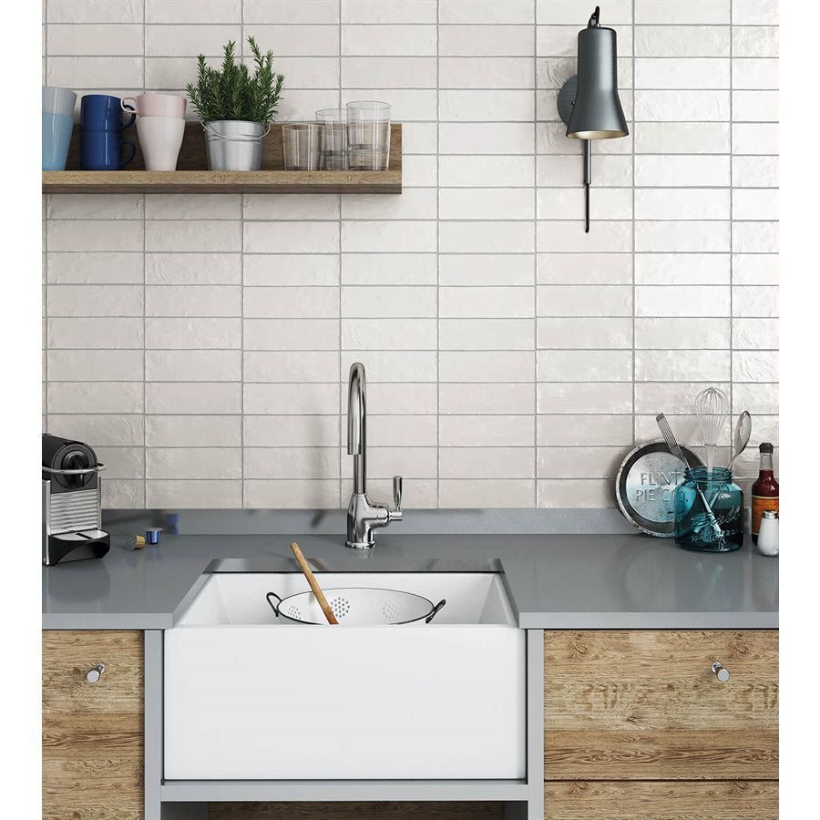
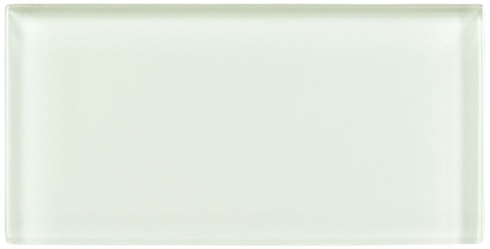
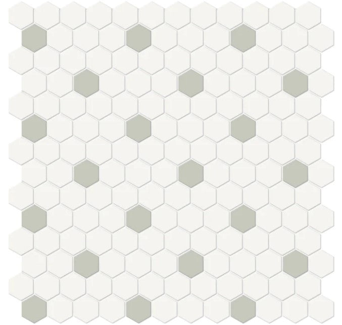
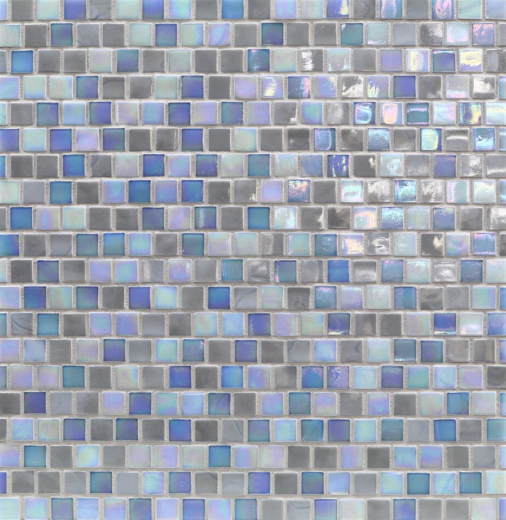
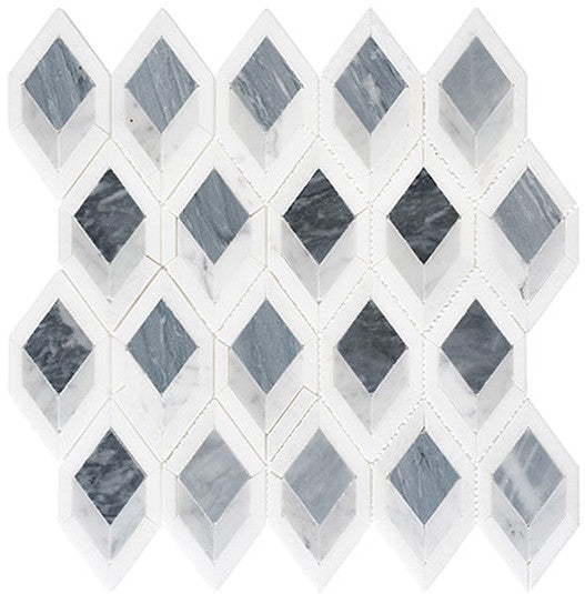
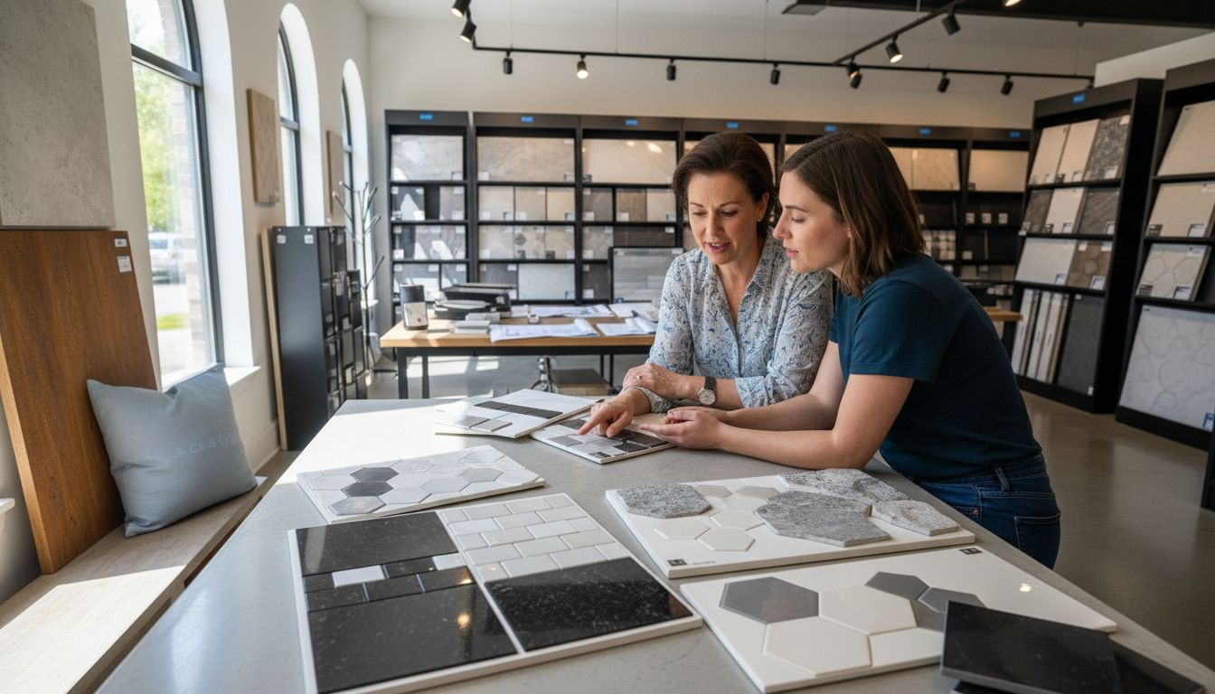
Selecting Tiles for High Contrast Spaces
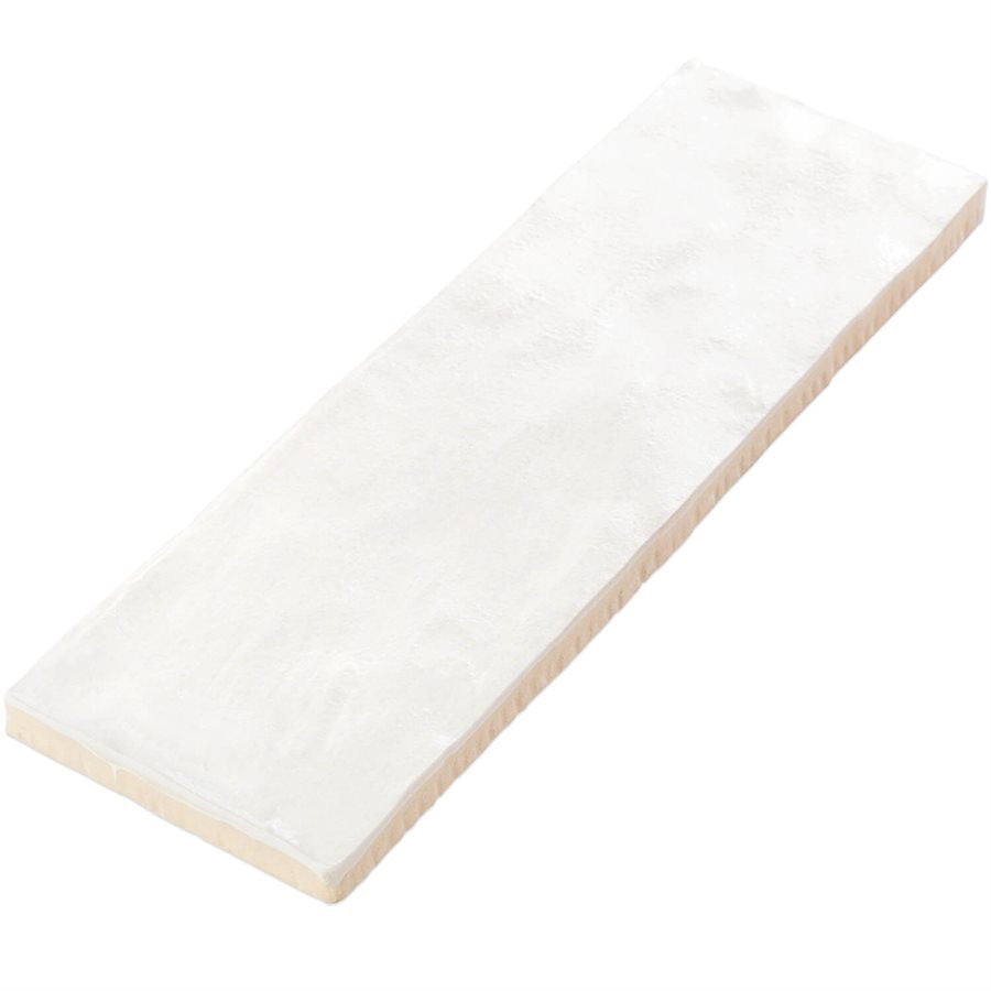
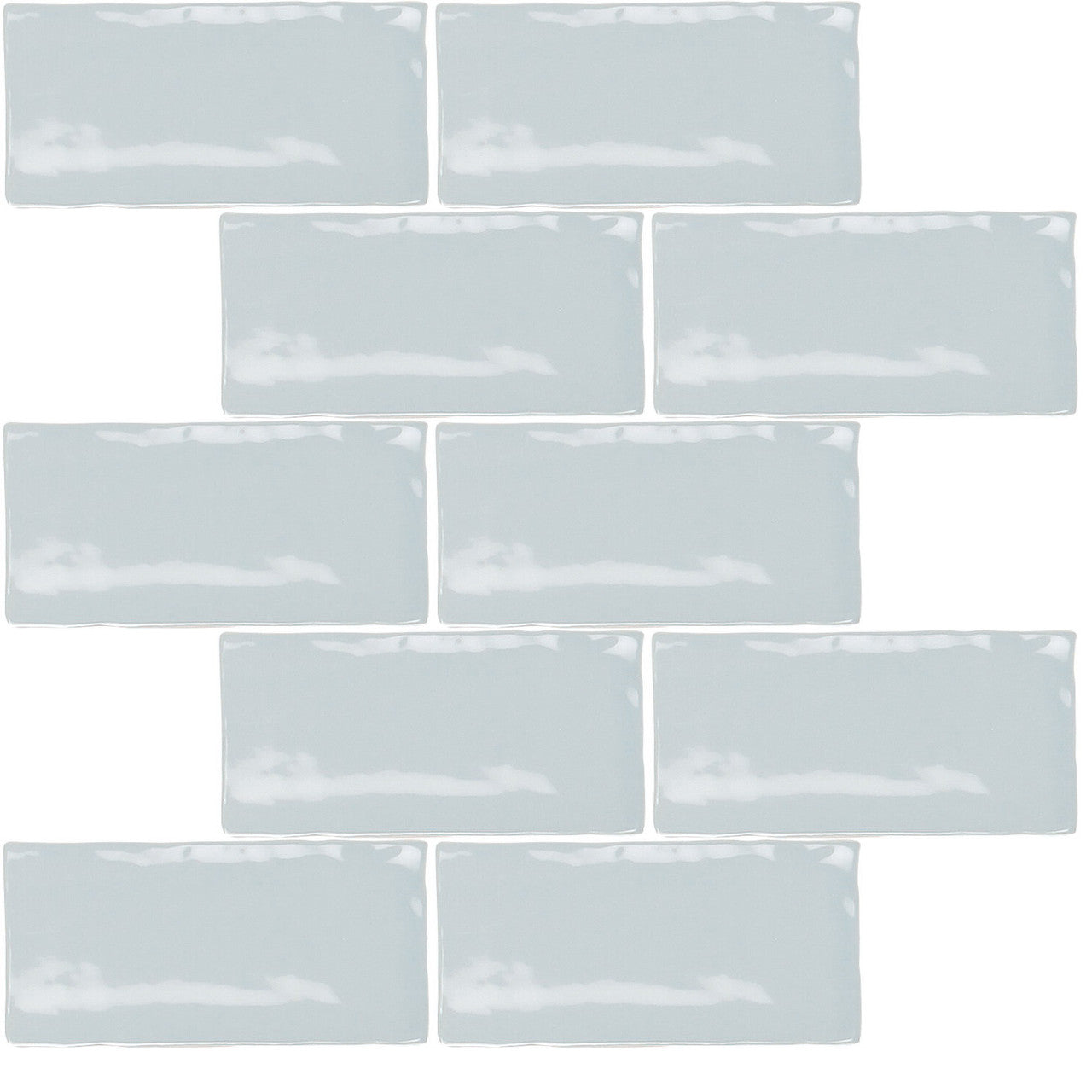
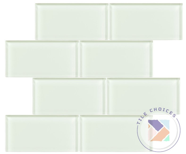
Tile selection is the cornerstone of creating compelling high contrast interior designs. According to Oklahoma State University Extension, the key is to choose tiles with “starkly differing colors, textures, or patterns to enhance visual interest and define areas within the space.”
When designing high contrast spaces, strategically pairing tiles becomes an art form. Hostos Community College Guides emphasizes the importance of selecting tiles that offer “significant differences in hue, texture, or pattern.” This means looking beyond simple color matching and instead focusing on creating visual dialogue between different tile elements.
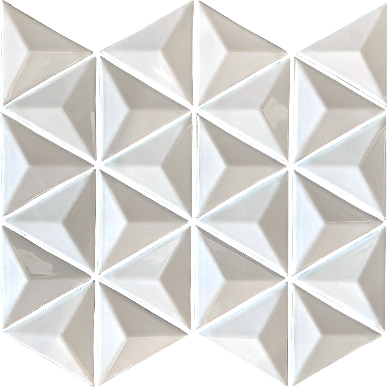
Consider these strategic approaches for tile selection:
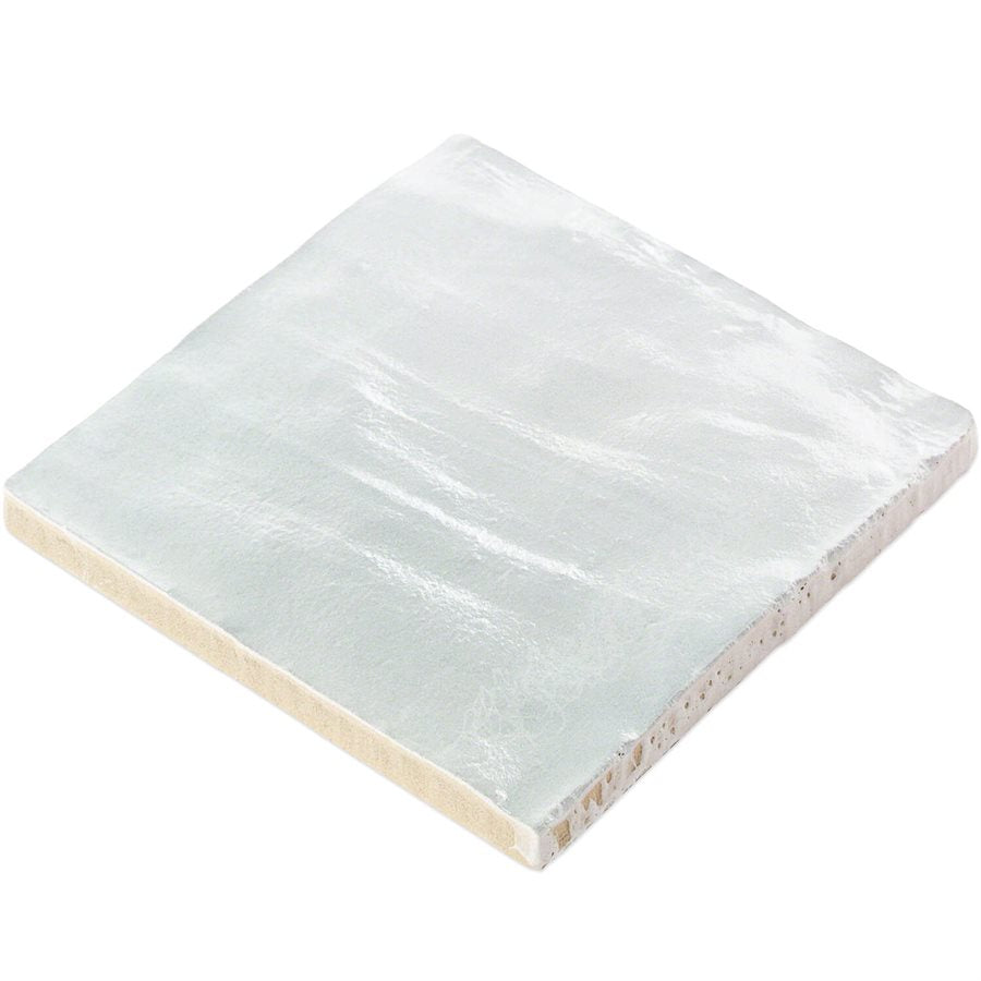
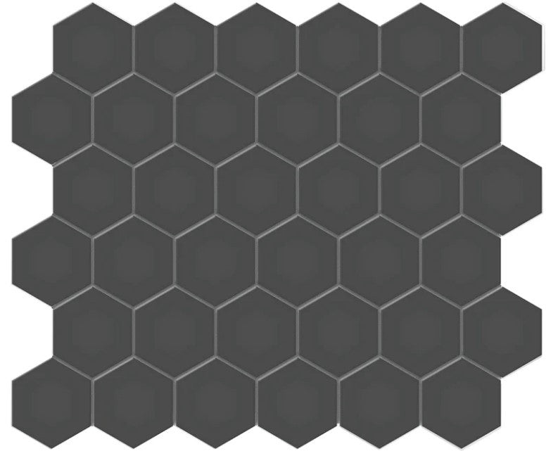
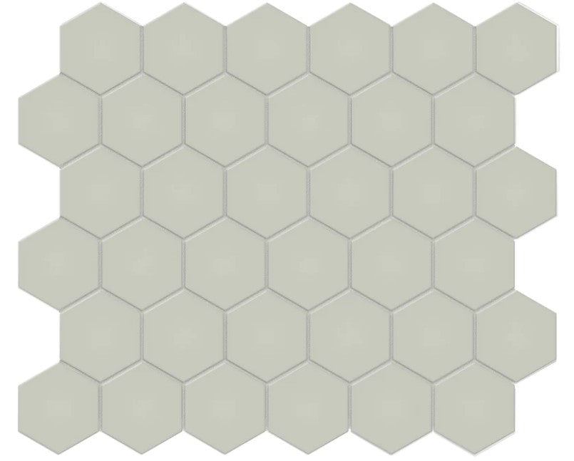
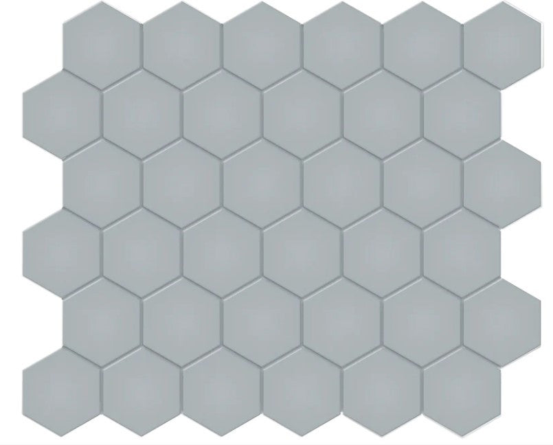
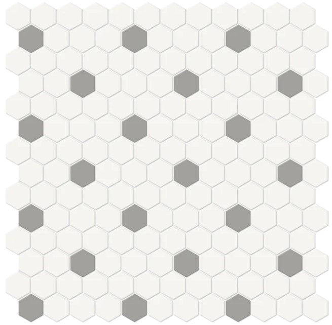
- Color Contrast: Pair dark and light tiles, such as deep charcoal alongside crisp white
- Texture Play: Combine smooth porcelain with rough natural stone tiles
- Pattern Dynamics: Mix geometric tiles with organic, free-form designs
- Material Variation: Blend ceramic with glass or metal tiles
- Size and Scale Contrast: Integrate large format tiles with smaller mosaic pieces
Selecting tiles for high contrast spaces requires a thoughtful approach.
 When mixing tile patterns for stunning spaces, remember that the goal is not chaos, but a carefully orchestrated visual symphony that draws the eye and creates depth. Successful high contrast tile design transforms spaces from ordinary to extraordinary, telling a visual story through intentional material and design choices.
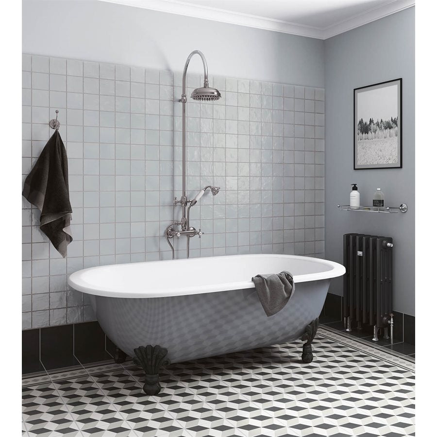
Applying High Contrast Design in Key Areas
High contrast design transforms ordinary spaces into extraordinary visual experiences by strategically manipulating design elements. According to the Federal Highway Administration, this approach involves “strategically using elements with significant differences in color, texture, and form to create focal points and guide movement within a space.”
Designers can leverage high contrast principles in specific areas to create dramatic visual impact. Architecture Courses notes that careful implementation “can transform ordinary spaces into dynamic and engaging environments” by thoughtfully considering elements like color, texture, and scale.
Key areas for high contrast design application include:
- Kitchen Backsplashes: Combine sleek, glossy tiles with matte, textured surfaces
- Bathroom Accent Walls: Pair bold, dark tiles with light, minimalist surroundings
- Fireplace Surrounds: Mix angular stone tiles with smooth ceramic elements
- Entryway Floors: Create visual interest with alternating tile sizes and patterns
- Shower Enclosures: Blend different tile materials for a striking visual narrative
When understanding the difference between wall and floor tiles, remember that high contrast design is about creating intentional visual tension. Each space tells a unique story through carefully selected materials, colors, and textures that challenge traditional design expectations and invite viewers to experience the environment in a more dynamic, engaging way.
Common Mistakes and Design Pitfalls
High contrast design demands precision and thoughtful execution. Oklahoma State University Extension warns that common mistakes often involve “overusing contrasting elements, leading to visual clutter, and neglecting balance, resulting in disjointed spaces.”
Designers and homeowners frequently fall into predictable traps when attempting to create high contrast environments. Hostos Community College Guides emphasizes that these pitfalls typically involve “excessive use of contrasting colors or patterns, which can overwhelm the senses.”
Key design mistakes to avoid include:
- Color Overload: Using too many bold colors simultaneously
- Texture Chaos: Mixing too many competing textures without a unifying element
- Scale Inconsistency: Failing to establish a clear visual hierarchy
- Symmetry Disruption: Creating contrast that feels random rather than intentional
- Material Clash: Combining incompatible materials without strategic consideration
When exploring tiles for high traffic areas, remember that successful high contrast design is about creating intentional visual tension, not visual warfare. The goal is to craft spaces that feel curated, not chaotic—where every contrast serves a deliberate aesthetic and functional purpose.
Transform Your Space with High Contrast Tile Designs
Creating a high contrast interior can be a daunting challenge when you want bold color clashes, diverse textures, and dramatic patterns without overwhelming your space. This guide highlights key concepts like chromatic contrast, textural opposition, and geometric interplay that are essential to master visual tension and create dynamic environments. If you find yourself struggling to choose tiles that achieve this balance or fear ending up with a chaotic, cluttered look, you are not alone.
TileChoices.com offers a carefully curated selection of tiles designed for exactly these challenges. Whether you want striking kitchen backsplashes, bathroom accent walls, or fireplace surrounds that make a statement, you can explore a variety of materials including ceramic, porcelain, natural stone, and glass to create stunning high contrast effects. Start by browsing our extensive collections to find tiles that deliver the perfect combination of color, texture, and scale.
Ready to turn your high contrast interior vision into reality? Visit TileChoices.com now to discover stylish options and order free samples to ensure your choices fit your unique design. Don’t settle for ordinary when you can craft spaces that inspire. Explore our resources and select transformative tiles today at TileChoices.com.
Frequently Asked Questions
What is high contrast interior design?
High contrast interior design is a design approach that uses bold differences in color, texture, and shape to create visually striking spaces. It focuses on the juxtaposition of opposing elements, such as light vs. dark colors and rough vs. smooth textures.
How can I effectively use high contrast in my interior design?
To effectively use high contrast, you can combine elements such as dark and light colors, mix varying textures, and integrate geometric shapes with organic forms. This strategic pairing emphasizes visual interest and creates dynamic spaces.
What are some common mistakes to avoid in high contrast design?
Some common mistakes include using too many bold colors at once (color overload), mixing too many competing textures, failing to establish a clear visual hierarchy, and allowing contrasts to feel random rather than intentional.
How do I choose tiles for high contrast spaces?
When selecting tiles for high contrast spaces, consider pairing dark and light tiles, combining smooth and rough textures, and mixing geometric patterns with organic designs. The key is to create a visual dialogue that enhances the overall aesthetic of the space.