Did you know that colors can lower stress and even slow the heart rate? Calming color schemes are more than just beautiful—they help shape peaceful environments and support mental health. Research shows that soft blues and gentle greens are linked to real physical benefits like reduced anxiety and better sleep. Discover how the right palette and thoughtful design choices can turn any room into a restorative space for mind and body.
Key Takeaways
| Point | Details |
|---|---|
| Importance of Color | Calming color schemes can significantly reduce stress and promote relaxation by influencing emotional and physiological responses. |
| Effective Color Choices | Cool colors like blue and green are most effective at creating tranquil environments, helping to stabilize mood and enhance cognitive function. |
| Design Principles | Employing design strategies such as the Rule of Three and the 60-30-10 Color Rule can enhance the effectiveness of calming color schemes in spaces. |
| Avoid Common Mistakes | To maintain a soothing atmosphere, avoid oversaturated colors, ensure balance with complementary shades, and consider the unique purpose of each room. |
Table of Contents
- Defining Calming Color Schemes And Their Benefits
- Popular Types Of Calm-Inspired Color Palettes
- Key Design Principles For Soothing Spaces
- Real-World Tile Applications With Calming Colors
- Common Mistakes To Avoid In Color Selection
Defining Calming Color Schemes and Their Benefits
Color isn’t just about aesthetics—it’s a powerful psychological tool that can dramatically influence our emotional state and physiological responses. Calming color schemes are intentionally curated palettes designed to reduce stress, promote relaxation, and create environments that support mental and physical well-being.
According to research from the Color Institute, cool colors like blue and green are particularly effective at activating our parasympathetic ‘rest-and-digest’ system. These colors consistently tie to low-arousal emotions such as peacefulness and stability. Soft, muted tones work best because they’re less stimulating and easier on our sensory perception. For instance, light blue has been scientifically proven to reduce blood pressure and heart rate, helping the body ease into a state of relaxation.
The benefits of calming color schemes extend beyond mere visual appeal. Here are key advantages:
- Stress Reduction: Gentle, harmonious colors can lower cortisol levels and minimize anxiety
- Improved Cognitive Function: Soft green tones have been shown to improve working memory and restore mental energy after cognitive tasks
- Enhanced Sleep Quality: Muted, cool-toned environments signal the brain to prepare for rest
- Emotional Regulation: Strategically chosen colors can help stabilize mood and promote inner calm
By understanding the psychological impact of color, you can transform any space into a sanctuary of tranquility—turning rooms into restorative environments that nurture both mind and body.
Popular Types of Calm-Inspired Color Palettes
Creating a serene environment starts with choosing the right color palette. Calm-inspired color schemes are more than just pretty combinations—they’re carefully crafted emotional experiences that transform spaces into peaceful retreats.
According to research from Home Harmony 247, certain color combinations are particularly effective at reducing stress. For example, soft blue and white can evoke profound tranquility, while moss green and cream have been shown to reduce perceived stress by approximately 20%. Designers and color experts recommend several standout palettes that consistently deliver a sense of calm and relaxation.
Here are some top calm-inspired color palettes to consider:
Here’s a quick overview of top calm-inspired color palettes and their key characteristics:
| Palette Name | Key Colors | Sensation Created | Best Spaces |
|---|---|---|---|
| Coastal Serenity | Light blue Soft white Pale gray |
Tranquility Airiness |
Bathrooms Bedrooms |
| Natural Zen | Muted sage Warm cream Light taupe |
Balance Nature-inspired |
Living rooms Entryways |
| Lavender Calm | Dusty lavender Pale grey Soft white |
Gentle calm Subtle luxury |
Bedrooms Spa-like bathrooms |
| Earthy Retreat | Deep forest green Warm beige Soft tan |
Grounding Warmth |
Living rooms Offices |
- Coastal Serenity: Light blue, soft white, and pale gray
- Natural Zen: Muted sage green, warm cream, and light taupe
- Lavender Calm: Dusty lavender, pale grey, and soft white
- Earthy Retreat: Deep forest green, warm beige, and soft tan
As suggested by The Spruce’s design experts, the most relaxing shades include pastel greens, pale blue-grays, and warm whites. These colors work beautifully in various spaces—from bathrooms seeking a spa-like atmosphere to bedrooms designed for ultimate relaxation. The key is selecting harmonious tones that work together to create a sense of tranquility and visual peace.
Key Design Principles for Soothing Spaces
Creating a truly calming environment goes beyond simply selecting soft colors—it requires understanding fundamental design principles that transform spaces into genuine sanctuaries of peace. Spatial harmony is about intentional, thoughtful arrangement that promotes mental and emotional well-being.
According to Le Corbusier’s renowned color theory, the foundation of a soothing space lies in selecting neutral and natural shades that create calm backgrounds. The legendary architect emphasized that color choices should directly correspond to a space’s intended function. This principle suggests that relaxation areas require different color strategies compared to more dynamic spaces like home offices or entertainment zones.
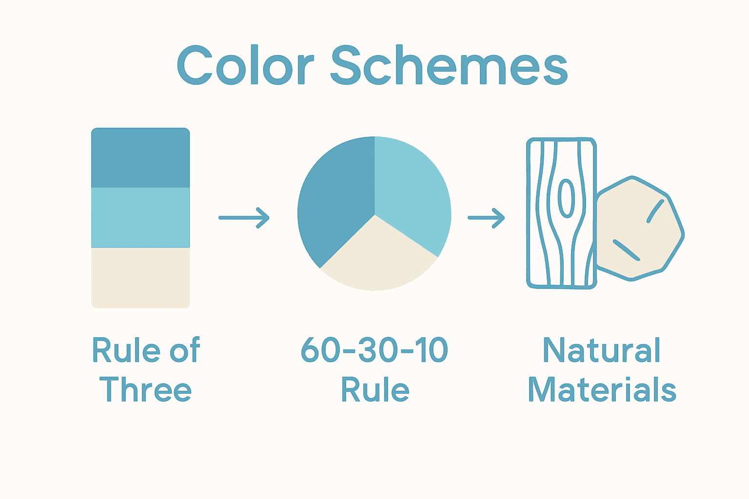
Key design principles for creating soothing environments include:
- The Rule of Three: Grouping design elements in odd numbers to foster visual balance and harmony
- 60-30-10 Color Rule: Distributing colors strategically (60% dominant color, 30% secondary color, 10% accent color)
- Natural Material Integration: Incorporating organic textures like wood, stone, and soft fabrics
- Minimalist Approach: Reducing visual clutter and focusing on essential, meaningful elements
By thoughtfully applying these principles, you can transform any space into a peaceful retreat that supports relaxation and emotional well-being.
 7 Essential Steps for Creating a Home Spa Oasis offers additional insights into designing truly tranquil environments.
Real-World Tile Applications With Calming Colors
Transforming spaces with calming tiles isn’t just about selecting pretty colors—it’s about creating intentional environments that promote relaxation and well-being. Tile selection plays a crucial role in establishing mood and atmosphere across different rooms in your home.
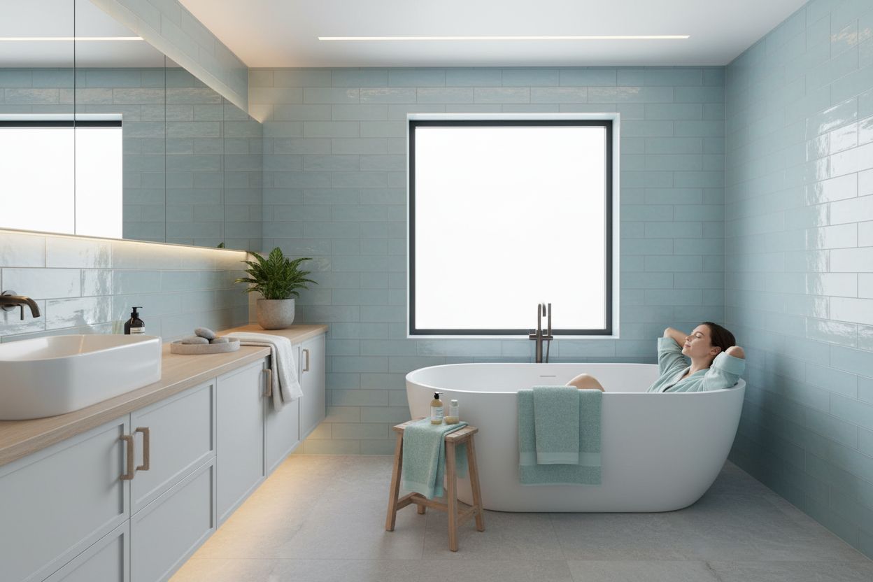
According to research from RAK Ceramics, soft neutrals like beige, cream, and light gray tiles are exceptional at creating warm, inviting atmospheres. Serene blues—ranging from sky blue to soft navy—effectively mimic ocean and sky landscapes, instantly fostering a spa-like ambiance. These color choices aren’t merely aesthetic decisions but strategic interventions in spatial design.
Ideal calming tile applications include:
- Bathroom Retreats: Soft sage or mint green tiles that connect to natural elements
- Kitchen Backsplashes: Off-white or soft ivory tiles that enhance light and create airiness
- Living Room Accent Walls: Gentle aqua or light blue tiles that promote tranquility
- Bedroom Floor Treatments: Warm neutral tones that provide a sense of comfort and grounding
When implementing calming tile designs, consider how different spaces require nuanced approaches. How to Match Tiles: Achieve a Seamless Look in Your Space can provide additional guidance on creating harmonious tile installations that support your desired emotional atmosphere.
Common Mistakes to Avoid in Color Selection
Creating a calming color scheme isn’t just about choosing soft hues—it’s about understanding the psychological nuances of color and avoiding potential pitfalls that can disrupt the intended emotional atmosphere. Color psychology is a delicate science that requires careful consideration and strategic approach.
According to research from the Color Institute, one of the most critical mistakes is using highly saturated or overly vivid colors that can overstimulate the nervous system instead of calming it. The key is moderation and thoughtful selection of muted tones that promote relaxation. Cognitive science research further suggests that while soft gray can act as a visual break and reduce perceived clutter, overusing neutral tones without strategic accent colors may inadvertently create a dull, uninviting space.
Common color selection mistakes to avoid include:
- Oversaturation: Using intensely bright or loud colors that create visual and emotional tension
- Lack of Balance: Relying too heavily on one color tone without introducing complementary shades
- Ignoring Room Function: Applying the same color scheme across different spaces without considering their unique purposes
- Neglecting Lighting: Failing to test how colors appear under various lighting conditions
Master Mixing Tile Patterns for Stunning Spaces can provide additional insights into creating harmonious color environments that support both aesthetic appeal and emotional well-being.
Bring Calming Color Schemes to Life with TileChoices.com
You have learned how calming color schemes can ease stress and create sanctuary-like environments. Yet, finding the right materials that truly reflect these tranquil palettes often feels overwhelming. You want your home to be a peaceful retreat and know that every color and surface matters. If you are struggling with bland or chaotic rooms or if you feel stuck choosing the best finishes for serene spaces, you are not alone. The challenge is connecting the soothing concepts from the article—like soft blues, muted greens, and gentle neutrals—with high-quality, durable materials that make them a reality.
Turn your inspiration into action by exploring the vast selection at TileChoices.com. Discover calming tiles made for bathrooms, kitchens, bedrooms, and beyond. Whether you want seamless color flow or practical solutions for humid areas, our curated collections match the design principles discussed in the article. Need step-by-step tile planning? Find helpful guidance in 7 Essential Steps for Creating a Home Spa Oasis and see ideas for combining hues when you visit How to Match Tiles: Achieve a Seamless Look in Your Space. Ready to feel the difference soothing colors can make? Visit TileChoices.com now and turn calm inspiration into a beautiful, lasting transformation.
Frequently Asked Questions
What are calming color schemes?
Calming color schemes are carefully curated palettes designed to reduce stress, promote relaxation, and create environments conducive to mental and physical well-being by utilizing soft, muted colors.
Which colors are considered most calming?
Cool colors, particularly soft shades of blue and green, as well as muted pastels like lavender and warm neutrals, are considered most calming. These tones help activate the body’s relaxation response, promoting a sense of tranquility.
How can I create a calming space with color?
To create a calming space, apply the Rule of Three in design, use the 60-30-10 color distribution (60% dominant color, 30% secondary, 10% accent), and integrate natural materials while minimizing visual clutter with a minimalist approach.
What mistakes should I avoid when selecting calming colors?
Avoid using overly saturated or vivid colors that can overstimulate, neglecting the function of the room, and failing to balance colors. Also, ensure colors are tested under different lighting to accurately assess their calming effects.