By the Tile Choices Team | Updated April 2026 | 10 min read
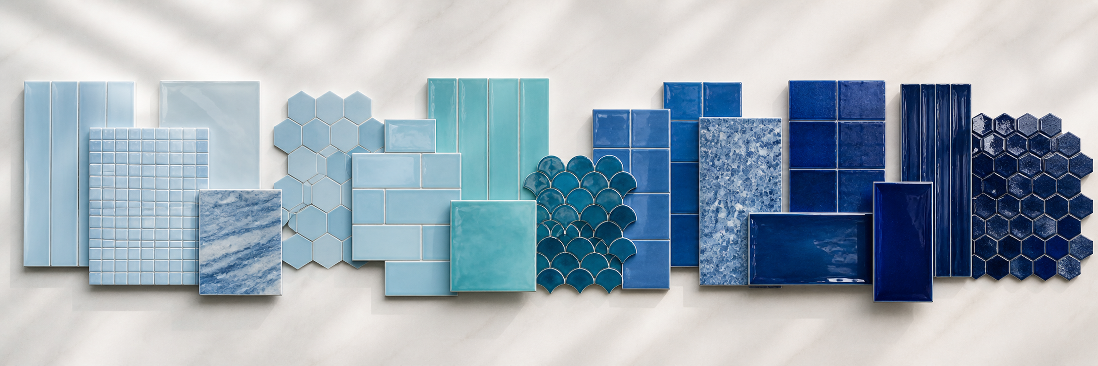
When someone says they want blue tile, the conversation has barely started. Navy and sky blue are as different from each other as charcoal is from light gray, both technically blue, but producing completely different results in a real room. Choose the wrong shade and the tile does something you did not intend. Choose the right one and the room becomes what you pictured when you started the project.
The problem is that blue is notoriously difficult to evaluate on a screen. Monitor calibration, ambient room lighting, and the surrounding pixels all affect how a blue reads digitally, often in ways that are impossible to predict. Tile that looks perfect online can read purple, green, gray, or washed-out in your actual space. This is the strongest argument for ordering physical samples, and this guide will help you understand what you are looking for when those samples arrive.
Navy Blue Tile
What it actually looks like
Navy is a deep, cool, very dark blue. On a tile, it absorbs light rather than reflecting it. Even a glossy finish on a navy tile is less reflective than a glossy lighter tile because the dark color absorbs so much of the incoming light. Navy reads as sophisticated, weighty, and intentional. It has strong associations with depth, water, and architectural seriousness that give it a gravitas that brighter blues do not carry.
How it behaves in a room
Navy creates enclosure. In a large, well-lit room with good natural light, this reads as cocooning and sophisticated. In a small, poorly lit room, it can read as oppressive. The variable that most determines which outcome you get is lighting, not the shade of blue itself. North-facing rooms with limited natural light are the hardest context for navy. South-facing rooms with abundant light handle it beautifully. Before committing to navy in any application, evaluate the light in that specific space at multiple times of day.
Best pairings
White cabinetry and surfaces. Brass and unlacquered brass hardware. White grout to define the tile pattern. Natural stone in white or warm gray. Clean minimal design, navy works best when the surrounding environment is restrained enough to let it be the statement.
Best applications
Bathroom feature wall, shower surround, kitchen backsplash focal zone, pool waterline for a dramatic deep-water effect. For specific bathroom ideas, read our guide to navy blue bathroom tile.
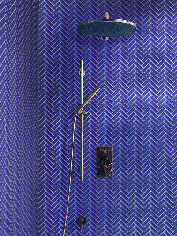
Cobalt Blue Tile
What it actually looks like
Cobalt is a saturated, pure mid-blue, brighter and more vivid than navy without the blue-green warmth of aqua. It is the blue of lapis lazuli, of Persian ceramics, of Ming Dynasty porcelain. There is centuries of design tradition behind cobalt that gives it a crafted, historic quality that feels genuinely timeless rather than trend-dependent. In glass tile specifically, cobalt has a luminosity that other materials cannot replicate, the color appears to glow slightly from within when natural light hits it.
How it behaves in a room
Cobalt is vivid. It does not recede into a wall, it asserts itself. In a kitchen backsplash, it becomes the focal point immediately and clearly. In a bathroom, it creates a formal, jewel-box quality. It can feel intense in very small spaces with limited natural light, but in most normal installations it reads as bold rather than overwhelming. Unlike navy, cobalt works in rooms with moderate rather than abundant natural light because it reflects more light than it absorbs.
Best pairings
White marble countertops. White or light gray cabinetry kept deliberately simple. White grout. Matte black or brass hardware. The rule with cobalt is to keep everything surrounding it quieter, cobalt does enough work on its own and does not need competition.
Best applications
Kitchen backsplash, bathroom accent wall, fireplace surround. For kitchen ideas specifically, read our blue tile backsplash guide.
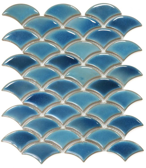
Aqua and Turquoise Blue Tile
What it actually looks like
Aqua and turquoise are blue-greens. They have green undertones that shift them from the cool, pure-blue family toward something warmer and more tropical. Aqua sits closer to blue; turquoise is more clearly green-leaning. In iridescent glass finishes, both shift dramatically as the angle of light changes, from blue to green to gold, which gives surfaces tiled in iridescent aqua a quality that is almost impossible to describe accurately in words. You have to see it in person to understand why it is so popular for pools and spa bathrooms.
How it behaves in a room
Aqua and turquoise feel warm and relaxed. They are the most casual of the blue family, more coastal and tropical than formal or sophisticated. They suit informal, outdoor-oriented spaces and any room where the design goal is relaxation rather than drama. They also pair more naturally with organic and warm materials, wood, rattan, terracotta, linen, than the cooler blues do.
Best pairings
Natural wood in any tone. Rattan and woven materials. White walls and ceilings. Warm stone. Simple chrome or brass fixtures. Linen and organic textiles as accessories.
Best applications
Pool tile, spa interiors, coastal bathroom, kitchen backsplash in a relaxed Mediterranean or beach-house aesthetic. The iridescent versions are particularly extraordinary in pools — read our full guide to blue pool tile ideas for details.
Sky Blue and Pale Blue Tile
What it actually looks like
Pale blue sits close to white on the value scale but with a clear blue tint that reads as cool, airy, and light. It is a soft color, not demanding attention, not making declarations, simply providing a pleasant and calming background. In ceramic, pale blue often has a handmade or vintage quality that feels nostalgic and warm. In glass, it is clean and contemporary.
How it behaves in a room
Pale blue is the most versatile shade in the blue family. It works with warm materials, cool materials, dark cabinetry, light cabinetry. It adds color without drama and brightens without the clinical quality that white tile can create. It is the right choice when you want your tile to contribute to the atmosphere of the room without becoming the focal point of the design.
Best pairings
Essentially everything. Particularly effective with white, cream, warm gray, natural wood, and stainless steel. Works in contemporary, traditional, and transitional styles without strain.
Best applications
Kitchen backsplash for kitchens where the cabinetry or countertops are the design statement. Bathroom wall tile in spaces where the goal is calm rather than drama. Guest bathrooms. The most practical choice for resale-focused renovations because it is broadly appealing.
Teal and Peacock Blue Tile
What it actually looks like
Teal sits at the intersection of blue and green, darker and more complex than aqua, with a richness that reads as sophisticated rather than casual. Peacock blue is a deeper, more jewel-toned version, lush and dramatic. Both have a depth that most pure blues lack.
Best applications
Bathroom feature wall, kitchen backsplash as a sophisticated alternative to navy or cobalt, fireplace surround. Pairs beautifully with brass fixtures, warm woods, and terracotta accessories.
Related Reading
- Blue Tile Backsplash Ideas for Kitchens
- Navy Blue Bathroom Tile Ideas
- Blue Pool Tile Ideas
- Blue and White Tile Ideas for Kitchens, Bathrooms and Pools
Need help choosing? Call us at 614-515-7816 or email sales@tilechoices.com.