By the Tile Choices Team | Updated April 2026 | 10 min read
A blue tile backsplash might be the most reliable way to give a kitchen real personality without gutting the whole room. Unlike a cabinet color change or new countertops, a backsplash is a contained investment, bounded on all sides, visible from across the room, and something you live with every single day. Get it right and it makes the kitchen feel designed. Get it wrong and you are looking at a tile removal project within three years.
The good news is that blue is one of the most forgiving backsplash colors to work with. It plays well with white, cream, gray, warm wood, stainless steel, and natural stone, which covers the vast majority of what people already have in their kitchens. The harder question is which shade of blue, which material, and which layout will actually work in your specific space. That is what this guide addresses.
The Shades of Blue and What They Do in a Kitchen
Before picking a tile, it helps to understand how each major shade of blue behaves in a real room, not just on a screen. Colors photograph differently than they look in person, and kitchens especially have varied light throughout the day that shifts how a blue tile reads.
Navy Blue
Navy is the most dramatic option. It creates a strong contrast against white or cream cabinetry and immediately becomes the focal point of the kitchen. The risk with navy is that it can feel heavy in kitchens with limited natural light, north-facing kitchens or spaces with small windows. Where it shines is in well-lit kitchens where you want the backsplash to make a genuine statement. Navy glass subway tile behind a range, running from countertop to hood, paired with brass fixtures and white marble countertops, is one of the most consistently beautiful kitchen combinations in current design.
Cobalt Blue
Cobalt sits between navy and bright blue, vivid and saturated, but with a richness that feels more artistic than simply bold. There is centuries of tradition behind cobalt in ceramics, from Portuguese azulejos to Dutch Delft, and that heritage gives cobalt tile a sense of craft that plain bright blue does not carry. In glass, cobalt genuinely glows in natural light rather than sitting flat on the surface. It works in both traditional and contemporary kitchens because it belongs to a long design lineage, not a trend cycle.
Aqua and Turquoise
Aqua and turquoise are warm blues, their green undertones make them feel tropical, coastal, and lively rather than cool and sophisticated. In a kitchen with natural wood open shelves, butcher block countertops, or a relaxed casual aesthetic, aqua glass mosaic tile creates exactly the right atmosphere. It reads as less formal than navy or cobalt, which is a feature rather than a limitation if that is the kitchen you are building.
Pale Blue and Sky Blue
Pale blue is the most versatile and the most forgiving. It introduces color without drama, which makes it the right choice when you want the backsplash to contribute warmth and personality without becoming the centerpiece of the design. A pale blue glossy ceramic subway tile with white grout and white shaker cabinets is a combination that has worked for decades and will keep working.
What Material Works Best for a Blue Kitchen Backsplash
Glass Tile
Glass is the top material recommendation for blue kitchen backsplashes. The color is fired into the glass itself rather than applied as a surface glaze, which means it has a depth and luminosity that ceramic cannot match. Glass is also completely non-porous, so cooking grease wipes off with a damp cloth. One important installation note: always use a white polymer-modified thinset with glass tile, standard gray thinset can show through translucent glass and muddy the color. Browse our glass tile collection to find the right blue for your kitchen.
Ceramic Tile
Ceramic blue tile is more affordable and offers surface treatments that glass cannot, crackle glazes, matte finishes, and the slightly imperfect character of artisanal ceramic. For traditional, farmhouse, or Mediterranean-style kitchens, a cobalt or navy glazed ceramic tile often feels more appropriate than glass. The finish reads as more craft-influenced and less sleek, which suits kitchens that are not aiming for a contemporary aesthetic.
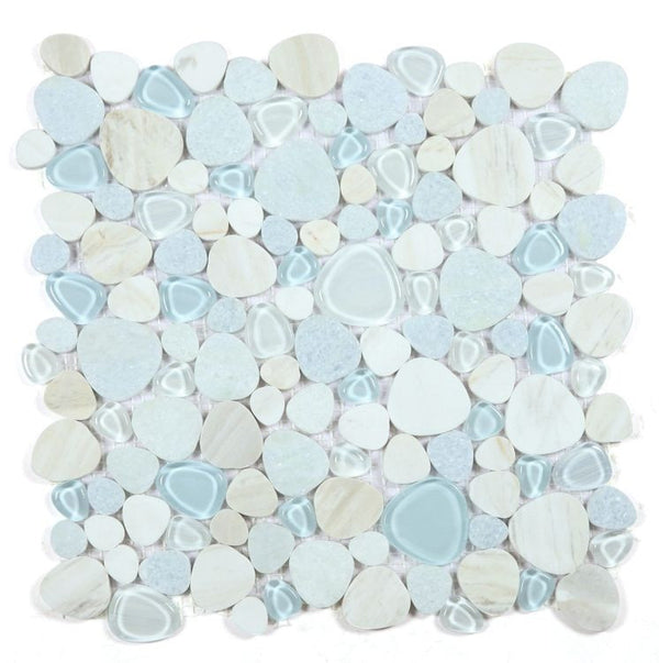
Glass Mosaic
Glass mosaic adds visual complexity that a standard subway or large-format tile cannot. When you install a blue glass mosaic behind a range, the many small pieces catch light at slightly different angles and create a surface that moves and shifts rather than sitting flat. A sheet of aqua or cobalt glass mosaic behind the range with a simpler field tile running the rest of the backsplash is a cost-effective way to achieve a custom focal point.
Design Combinations That Actually Work
Navy Tile, White Cabinets, Brass Hardware
This is the most popular blue backsplash combination in 2026 and it earns that position. The contrast between deep navy and crisp white is clean and deliberate. Brass adds warmth that stops the palette from feeling cold. White grout keeps the tile pattern legible. Add white marble or quartz countertops and you have a kitchen that looks genuinely designed without being trendy.
Cobalt Glass Tile, White Marble Countertops, Simple Cabinetry
The richness of cobalt glass against white marble with gray veining creates a kitchen that feels luxurious. Keep cabinetry flat-front or simple shaker in white or very light gray, the backsplash and countertop are carrying the design and the cabinets should not compete.
Aqua Mosaic, Natural Wood, Open Shelves
This is the coastal kitchen combination. Warm wood open shelves, butcher block countertops, simple white walls, and an aqua glass mosaic backsplash create a kitchen that feels relaxed and livable. Add a ceramic farmhouse sink and linen textiles and it works perfectly.
Pale Blue Ceramic, Gray Cabinets, Stainless Appliances
A soft blue backsplash with warm gray cabinetry is sophisticated and calming. Both colors sit in the cool family but are different enough to read as intentional contrast. Works especially well in north-facing kitchens that get less natural light, the pale blue reflects without the harshness that white tile can create in low-light spaces. Browse our full kitchen backsplash tile collection to compare all material options side by side.
Related Reading
- Navy Blue Bathroom Tile Ideas: Design Combinations That Work
- Shades of Blue Tile: How to Choose Between Navy, Cobalt, Aqua and More
- Blue and White Tile Ideas for Kitchens, Bathrooms and Pools
- Top Kitchen Backsplash Trends for 2026
Need help choosing? Call us at 614-515-7816 or email sales@tilechoices.com.