Selecting the right tile color can change the entire feel of a room. Studies show that lighting and color together can make a space feel either twice as large or cramped and dark. If you want results that feel balanced and inviting, you need more than just a good eye for shades. Understanding how light, mood, and your current decor work together will help you make choices you love every day.
Table of Contents
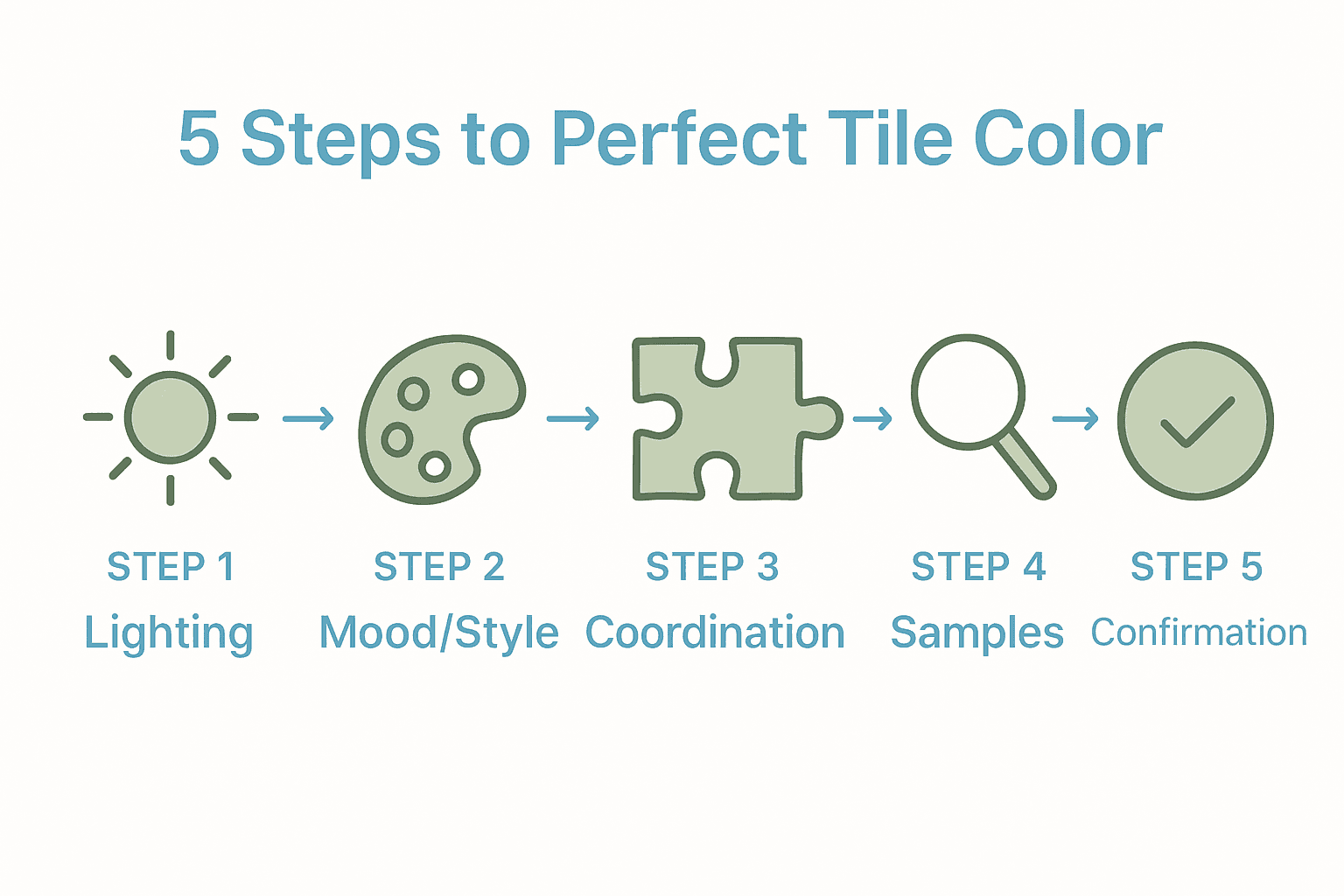
- Step 1: Assess Space Lighting And Dimensions
- Step 2: Identify Desired Mood And Style
- Step 3: Coordinate Tile Colors With Existing Elements
- Step 4: Order Samples And Evaluate In Space
- Step 5: Confirm Color Choices Before Purchase
Quick Summary
| Key Point | Explanation |
|---|---|
| 1. Assess lighting before choosing tile colors | Understand how natural and artificial light affects colors to enhance your space’s aesthetics and perceived size. |
| 2. Define your desired mood and style | Create a mood board to capture the atmosphere you want, guiding your tile color selections based on emotional impact. |
| 3. Coordinate colors with existing elements | Ensure new tiles harmonize with existing design features like walls and cabinets to achieve a cohesive look. |
| 4. Evaluate samples in real lighting | Request tile samples and assess them in your actual space under different lighting conditions for accurate color perception. |
| 5. Confirm decisions before purchasing | Spend time living with tile samples and use a decision matrix to evaluate color interactions before finalizing your choice. |
Step 1: Assess Space Lighting and Dimensions
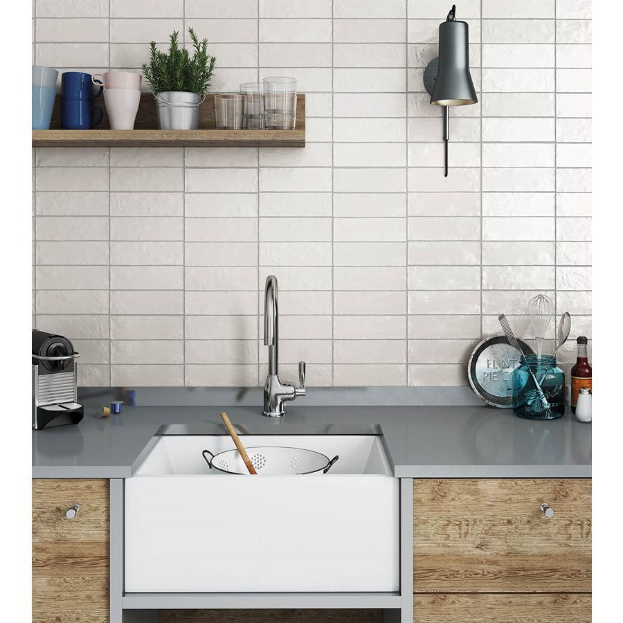
Choosing tile colors starts with understanding your space’s unique lighting and dimensional characteristics. This crucial first step helps you select colors that will not just look beautiful but truly enhance the room’s overall aesthetic and perceived size.
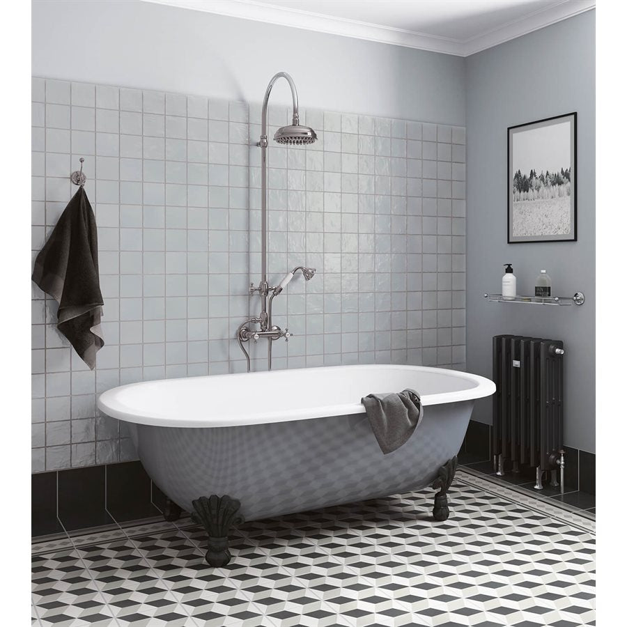
According to CalState, interior colors and finishes dramatically impact how light reflects and transforms a space. Darker colors absorb more light and can make rooms feel smaller, while lighter colors reflect more illumination and create an expansive feel. Start by evaluating natural and artificial light sources in your room. Take note of window placements, overhead lighting, and any additional light fixtures.
To assess your space effectively, walk around and observe how light moves throughout the day. Stand in different areas and notice which spots feel brightest or darkest. As GSA recommends, consider daylighting strategies that help you understand how windows and skylights impact your room’s illumination. Measure your room’s dimensions and create a simple sketch noting light entry points, which will help you make more informed tile color decisions.
Pro Tip: Bring tile samples home and observe them under different lighting conditions throughout the day before making a final selection.
Your next step will involve narrowing down your color palette based on these lighting insights.
Step 2: Identify Desired Mood and Style
Identifying the mood and style for your tile selection is about translating your personal aesthetic vision into tangible design choices. This step transforms abstract feelings into concrete design direction that will guide your entire tile selection process.
According to FrontlineJournals, lighting and design elements contribute significantly to creating emotionally engaging spaces. Think about the atmosphere you want to create warm and inviting warmth, sleek modern minimalism, rustic charm, or elegant sophistication. Consider how different tile colors and textures can evoke specific emotional responses.
Journals OpenEdition highlights how colors and illumination expressively impact human perception of interior spaces. Start by collecting visual inspiration through design magazines, Pinterest boards, or home decor websites. Create a mood board that captures your desired aesthetic elements color palettes, textures, and overall feeling. Pay attention to how different tile colors interact with light and create specific atmospheric qualities.
Pro Tip: When selecting tiles, always imagine how they will look not just in isolation but as part of your entire room’s design narrative.
Your next step will involve translating these mood and style insights into practical tile color selections.
Step 3: Coordinate Tile Colors With Existing Elements
Coordinating tile colors with your existing design elements transforms a good design into a great one. This crucial step ensures your new tiles harmonize seamlessly with the room’s current aesthetic and functional components.
According to NIST Publications, color coordination is about creating a relationship between major elements like appliances, cabinets, walls, and floors. Start by gathering physical samples of your existing elements wood tones, countertop colors, cabinet finishes, and wall paint. Lay these samples together to understand their underlying color relationships and undertones.
Professional designers recommend a strategic approach to color matching. Architecture Courses emphasize testing colors in actual light conditions and on real materials. This means bringing tile samples home and observing how they interact with your existing elements under different lighting throughout the day. Look for complementary or contrasting colors that create visual interest while maintaining overall design harmony.

Pro Tip: When in doubt, choose tiles with neutral undertones that can adapt to multiple design styles and existing color schemes.
Your next step will involve creating color combinations that bring your design vision to life.
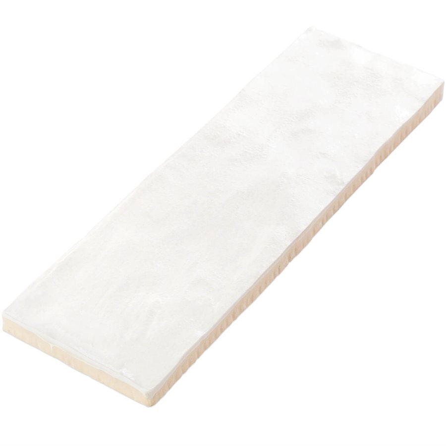
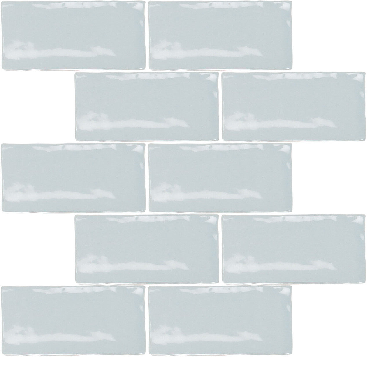
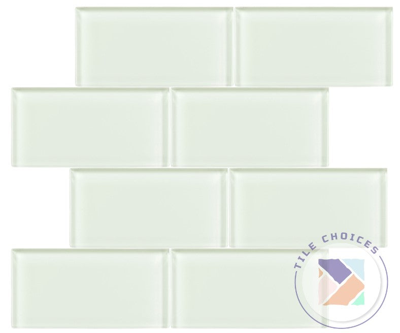
Step 4: Order Samples and Evaluate in Space
Ordering and evaluating tile samples is your critical quality checkpoint before making a final investment. This step allows you to experience tile colors, textures, and interactions in your actual space under real lighting conditions.
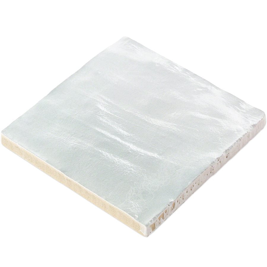
Architecture Courses strongly advises against relying on store lighting or small swatches, emphasizing that color perception changes dramatically depending on context. Request physical tile samples from your preferred suppliers and have them shipped directly to your home. Arrange these samples in your intended installation area, paying close attention to how they look at different times of day and under various lighting conditions.
According to NIST Publications, illumination profoundly influences color perception. Take time to observe your samples during morning sunlight, afternoon brightness, and evening artificial lighting. Move samples around to see how they interact with surrounding surfaces like walls, countertops, and flooring. This meticulous approach ensures you select tiles that look perfect not just in isolation, but within the full context of your space.
Pro Tip: Photograph tile samples in your space under different lighting to create a visual reference for comparison.
Your next step will involve making a final selection based on these comprehensive evaluations.
Step 5: Confirm Color Choices Before Purchase
Confirming your tile color choices is the final critical step before making a significant design investment. This process transforms your careful planning into a confident purchasing decision that you will be happy with for years to come.
Architecture Courses emphasizes the importance of testing colors beyond superficial assessments. This means going beyond simple swatch comparisons and creating a comprehensive evaluation strategy. Arrange your selected tile samples in multiple locations within your space, comparing how they look during different times of day and under various lighting conditions. Take detailed photographs of these arrangements to create a visual record and help you make an objective comparison.
According to NIST Publications, color perception is dramatically influenced by surrounding illumination. Spend at least 48 hours living with your tile samples before making a final decision.
 Observe how the colors interact with your existing surfaces during morning sunlight, afternoon brightness, and evening artificial lighting. Consider how the tiles look when placed next to walls, countertops, and flooring to ensure they create the desired visual harmony.
Pro Tip: Create a decision matrix that rates each tile sample based on color consistency, light interaction, and overall aesthetic appeal.
Your next step will involve making your final tile selection with confidence and excitement.
Discover the Perfect Tile Colors to Bring Your Vision to Life
Choosing the right tile colors can feel overwhelming when you face challenges like understanding your space’s lighting, matching existing design elements, and picturing how tiles will look throughout the day. This guide breaks down those key steps to help you make confident choices that create stunning spaces with the mood and style you desire. You deserve tiles that not only fit your practical needs but also inspire and transform your home or project.
At TileChoices.com, we understand these challenges and offer a vast selection of high-quality tiles along with the convenience of ordering samples to see colors in your own lighting. Whether you want ceramic, porcelain, natural stone, or metal finishes, our curated collections make it easy to find tiles that harmonize perfectly with your existing elements and style vision. Don’t settle for uncertainty when you can confidently choose with expert guidance and a robust product range at your fingertips.
Explore our full range today at TileChoices.com and take advantage of our sample request option so you can evaluate colors in your space before buying. Your perfect tile color is waiting—start your transformation now and build a space that truly reflects your style and vision.
Frequently Asked Questions
How do I assess my space’s lighting and dimensions for tile color selection?
To assess your space’s lighting and dimensions, evaluate both natural and artificial light sources, noting how they change throughout the day. Measure your room’s dimensions, and make a simple sketch that indicates light entry points to help inform your tile color choices.
What mood or style should I consider when choosing tile colors?
Consider the atmosphere you want to create—whether it’s warm and inviting, sleek and modern, rustic, or elegant. Collect visual inspiration through mood boards, including color palettes and textures, to guide your tile selection process.
How can I coordinate tile colors with my existing design elements?
Coordinate tile colors by gathering samples of your existing elements, such as wood tones or wall paints, and evaluating their color relationships. Lay these samples next to tile options to see how they harmonize and create a cohesive look in your space.
What steps should I take to evaluate tile samples in my space?
Order physical samples of your chosen tiles and place them in your intended installation area. Observe how the colors and textures look at different times of the day and under varying lighting conditions to ensure they meet your expectations.
How can I confirm my tile color choices before making a purchase?
Confirm your tile color choices by arranging samples in multiple locations within your space and taking photographs for comparison. Spend at least 48 hours with the samples, observing how they interact with existing surfaces to ensure you make a well-informed decision.
What should I do if I’m unsure about my tile color selections?
If you’re unsure about your tile color selections, create a decision matrix that rates each sample based on color harmony, light interaction, and aesthetic appeal. This structured approach will help clarify your preferences and support a confident choice.