Did you know that color alone can influence up to 90 percent of first impressions in a room? The shades you choose grab attention and quietly shape how people feel, focus, and interact in any space. Interior design is more than matching cushions and curtains. The right color combinations transform a cold room into a cozy retreat, or turn a busy kitchen into a place of calm energy, all through the science of color psychology.
Table of Contents
- Defining Color Psychology In Interior Design
- Principles Of Color Theory And Its Effects
- Color Choice Impact On Space Perception
- Applying Color Psychology To Tile Selection
- Common Mistakes In Tile Color Usage
Key Takeaways
| Point | Details |
|---|---|
| Color Psychology Matters | Understanding how colors influence emotions and moods can transform spaces into intentional emotional experiences. |
| Strategic Color Use | Apply colors intentionally based on their psychological effects to support desired atmospheres in specific rooms. |
| Spatial Perception Techniques | Leverage color choices to manipulate how spaces are perceived, making them feel larger or cozier without physical changes. |
| Avoid Common Mistakes | Be mindful of overusing certain colors and consider the balance of color with textures and lighting to enhance emotional impacts. |
Defining Color Psychology in Interior Design
Color psychology transforms interior design from mere aesthetic arrangement into a powerful emotional language. At its core, this discipline explores how different colors influence human perception, mood, and behavior within physical spaces. Color psychology allows designers to strategically craft environments that communicate specific feelings and support desired psychological experiences.
According to research from Architecture Design Courses, colors are not just visual elements but emotional triggers. Blues can create calming atmospheres, yellows inject cheerfulness, and grays convey sophisticated neutrality. Each hue carries inherent psychological properties that can subtly manipulate how people feel and interact within a space.
Here’s a comparison of the psychological effects and best uses of popular color choices in interior design:
| Color | Psychological Effect | Best Used In |
|---|---|---|
| Blue | Calming Fosters focus |
Bedrooms Home offices |
| Yellow | Cheerful Uplifting |
Kitchens Living rooms |
| Gray | Neutral Sophisticated |
Modern spaces Bathrooms |
| White | Pure Open Sterile |
Bathrooms Accents |
| Red | Energizing Stimulating |
Dining areas Accent walls |
| Green | Relaxing Refreshing |
Living rooms Kitchens |
Designers leverage color psychology by understanding nuanced emotional responses. White might symbolize purity and openness, but excessive use can feel sterile and uninviting. Deep reds can energize a room, while soft greens promote relaxation. The strategic application requires deep understanding of color interactions and individual psychological responses.
- Colors communicate emotions without words
- Different hues trigger specific psychological responses
- Professional designers use color as a deliberate design tool
- Psychological impact varies based on cultural and personal contexts
Successful color psychology in interior design isn’t about random selection but intentional, informed choices that transform spaces into emotionally intelligent environments.
Principles of Color Theory and Its Effects
Color theory is a fundamental design discipline that goes beyond simple aesthetic choices, providing designers with strategic tools to manipulate visual perception and emotional responses within interior spaces. According to research from Architecture Courses, the color wheel and color harmony principles are crucial for creating visually compelling and psychologically resonant environments.
According to Color Cypher Research, designers can strategically use color to solve common spatial challenges. Cool colors like blues and greens can visually expand spaces, making rooms feel larger and more open, while warm colors such as reds and oranges create intimate, cozy atmospheres. This spatial manipulation demonstrates how color is a powerful design tool beyond mere decoration.
Color theory encompasses several key color scheme approaches that designers employ:
- Complementary Schemes: Using colors opposite each other on the color wheel
- Analogous Schemes: Utilizing colors adjacent to each other for harmony
- Triadic Schemes: Combining three colors equally spaced on the color wheel
- Monochromatic Schemes: Exploring variations of a single color
Mastering color theory requires understanding not just visual aesthetics, but the profound psychological and spatial impacts different color combinations can create. The most successful interior designs seamlessly blend technical color knowledge with intuitive emotional intelligence.
Color Choice Impact on Space Perception
Space perception is a complex visual phenomenon dramatically influenced by color choices in interior design. According to research from Color Cypher, colors possess remarkable abilities to visually transform spatial experiences, making rooms feel larger, smaller, more intimate, or more expansive through strategic application.
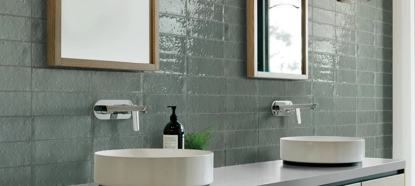
Research from Architecture Courses reveals that cool colors like blues and greens naturally recede visually, creating an illusion of increased space and openness. Conversely, warm colors such as reds and oranges advance visually, generating a sense of intimacy and compression. This optical manipulation allows designers to dramatically reshape perceived room dimensions without physical reconstruction.
![]()
Key spatial perception strategies include:
- Light ceiling colors expand vertical perception
- Dark colors on walls or ceilings can lower perceived room height
- Soft blues and grays enhance workspace focus and efficiency
- Muted greens reduce psychological tension and stimulate creative thinking
Effective color selection requires understanding these nuanced visual dynamics. By carefully choosing color palettes, designers can transform spaces, influence emotional responses, and create environments that feel precisely tailored to their intended psychological and functional purposes. Understanding Matte vs Glossy Tiles can further enhance these spatial perception techniques by complementing color strategies with surface texture considerations.
Applying Color Psychology to Tile Selection
Tile color selection goes far beyond aesthetic preferences, serving as a powerful tool for crafting intentional emotional experiences within interior spaces. According to research from Architecture Courses, different colors can dramatically transform room atmospheres, influencing mood, energy, and psychological perception.
Research from OLT Design highlights that while white tiles symbolize purity and openness, they can feel sterile if used exclusively. Strategic color choices involve balancing pure tones with complementary textures and accent elements. Blues create calm in bedrooms and focus in home offices, while greens introduce freshness to kitchens and living spaces, making tile selection a nuanced psychological design strategy.
Key considerations for applying color psychology to tile selection include:
- Match tile colors to room function and desired emotional response
- Incorporate warm textures with neutral tiles to prevent sterility
- Use cool colors to visually expand smaller spaces
- Combine colors that promote intended psychological experiences

Successful tile selection requires understanding color’s profound emotional language. How to Match Tiles can help designers and homeowners navigate these complex visual and psychological considerations, transforming tiles from mere surface coverings into sophisticated emotional design elements.
Common Mistakes in Tile Color Usage
Color selection in tile design is a nuanced art that requires careful consideration and strategic planning. According to research from Architecture Courses, one of the most prevalent mistakes designers and homeowners make is neglecting the profound psychological impact of color choices in interior spaces.
Research from OLT Design reveals that overusing certain colors can create unintended and potentially uncomfortable environments. White tiles, for instance, can make spaces feel sterile and cold when used excessively. The key is to balance color usage with complementary textures, lighting, and accent elements that soften and warm the overall aesthetic.
Common tile color usage mistakes include:
- Overwhelming a space with dark colors that visually shrink the room
- Using bright colors without considering their psychological impact
- Neglecting the importance of color balance and harmony
- Ignoring how lighting interacts with tile color selections
- Failing to consider the room’s primary function and desired emotional atmosphere
Master Mixing Tile Patterns can help designers and homeowners navigate these complex color considerations, ensuring that tile selections not only look beautiful but also create the intended emotional and psychological experience within a space.
Transform Your Space with the Power of Color Psychology
Understanding how colors influence mood and perception is a game changer for your interior design projects. The article highlights key challenges like avoiding sterile environments caused by overusing whites or preventing rooms from feeling too small with dark colors. It also shows how strategic use of vibrant hues like blues and greens can create calming or refreshing atmospheres. If you want to turn these psychological insights into stunning, emotionally intelligent spaces, tile selection plays a crucial role.
At TileChoices.com, explore our wide selection of tiles designed to perfectly match your color psychology goals. Whether you want to energize a dining area with warm reds or foster calm in a bedroom with cool blues, our customizable tile options help you realize your vision. Avoid common mistakes in tile color usage by leveraging our detailed product descriptions and samples to find the perfect balance of color and texture. Start transforming your home today. Discover inspiring ideas and shop now at TileChoices.com to bring your emotionally charged design vision to life!
Frequently Asked Questions
What is color psychology in interior design?
Color psychology explores how different colors influence human emotions and behavior within spaces, allowing designers to create environments that evoke specific feelings.
How do colors affect spatial perception?
Colors can visually manipulate space; cool colors like blues and greens can make rooms feel larger, while warm colors like reds can create a sense of intimacy and warmth.
What are common mistakes in tile color usage?
Common mistakes include overusing dark colors that shrink a room, neglecting color balance, and not considering how lighting interacts with tile colors.
How should I choose tile colors for different rooms?
Tile colors should match the room’s function and desired atmosphere—calmer colors like blues for bedrooms, refreshing greens for kitchens, and bright shades for more energetic spaces.
Recommended
- Master Mixing Tile Patterns for Stunning Spaces – Tile Choices
- How to Match Tiles: Achieve a Seamless Look in Your Space – Tile Choices
- 8 Kitchen Lighting Inspiration Ideas for Your Renovation – Tile Choices
- Understanding Metallic Finish Tiles: A Comprehensive Guide – Tile Choices
- The Role of Color Psychology in Web Design: Captivating Users through Emotional Connections – Lind Creative


