Most people choose their kitchen tile first. Then countertops. Then cabinetry. Hardware comes last, and by the time it does, there are already four or five materials in the room that the hardware needs to work with. Get the finish right and the whole kitchen reads as designed from the start. Get it wrong and something feels off that is hard to name but impossible to ignore.
This guide walks through how to match cabinet hardware finishes to the most common kitchen tile palettes. Whether you are working with white subway tile, warm stone, cool-toned porcelain, or bold glass mosaic, there is a clear logic to finding a hardware finish that completes the room rather than competing with it. We will also look at the most popular finishes in the Jeffrey Alexander cabinet hardware line and how each one performs across different tile types.
Why the Finish Decision Matters More Than the Style Decision
When homeowners think about cabinet hardware they tend to focus on shape first, knob or pull, curved or straight, traditional or modern. Style matters, but finish is the variable that actually determines whether the hardware fits the room. A beautifully designed bar pull in the wrong finish will look like it wandered in from a different renovation. A simple round knob in the right finish can anchor the entire palette.
Finish is the surface quality and color of the metal, and it interacts with every reflective and tonal element already in the kitchen. Tile gloss level, grout color, countertop veining, and even window light all affect how a hardware finish reads in the space. A Brushed Gold pull looks different against white subway tile than it does against dark slate-look porcelain. Understanding these interactions before you buy is what separates a kitchen that looks finished from one that looks assembled.
The Most Common Kitchen Tile Palettes and the Hardware Finishes That Work With Them
White and Bright Subway Tile
White ceramic or porcelain subway tile, in 3 x 6, 4 x 12, or elongated formats, is the most installed kitchen backsplash tile in the country, and for good reason. It is versatile, timeless, and it plays well with almost any cabinet color. The hardware finish decision in a white subway tile kitchen is primarily about contrast level.
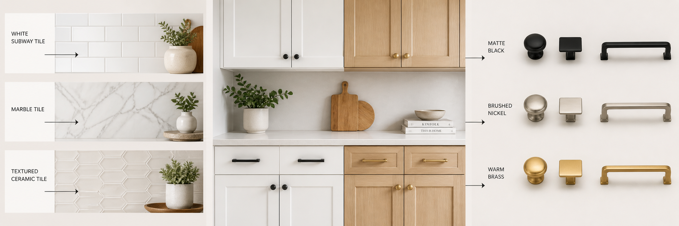
Matte Black is the sharpest choice, the contrast against white tile and white or light grout is clean, graphic, and intentional. It reads as modern without being cold and works across white, gray, navy, and natural wood cabinetry. Brushed Gold adds warmth to a white tile kitchen and has been the dominant hardware trend for several years running, it softens the brightness of the tile and adds a layer of richness, particularly against white shaker cabinets. Satin Nickel is the classic neutral, lower contrast than Matte Black but more warmth than Polished Chrome, and it coordinates naturally with stainless appliances. Polished Chrome is the right call when you want a bright, reflective contrast that leans contemporary and pairs with polished or glossy tile finishes.
Warm-Toned Tile: Cream, Beige, Terracotta, and Warm Gray
Warm tile palettes, cream ceramic, beige stone, terracotta-toned encaustic, warm gray porcelain, call for hardware finishes that echo rather than fight that warmth. Introducing a cool-metal finish into a warm palette creates a disconnect that the eye reads as a mistake even if the brain cannot name it.
Brushed Gold is the natural anchor for warm tile kitchens. The yellow-gold tone mirrors the warmth in the tile without needing to match it exactly. Satin Bronze adds more brown and amber than gold and suits warm tile with deeper earth tones, terracotta, warm tan, medium-brown stone. Brushed Oil Rubbed Bronze brings in the darkest warm tone and works especially well against cream or beige tile when the cabinetry is also on the warmer side, painted in linen, warm white, or a soft green-gray. Lightly Distressed Antique Brass suits the farmhouse end of the warm tile range, particularly against handmade-look ceramic or textured stone tile where the slight variation in the metal finish mirrors the variation in the tile surface.
Cool-Toned Tile: White, Icy Gray, Blue-Gray Porcelain, and Glass Tile
Cool tile palettes, bright white glass tile, icy gray porcelain, blue-gray stone, pale blue ceramic, have a clean, architectural quality. The hardware finishes that work best here either match the coolness of the palette or create deliberate contrast against it.
Polished Chrome is the most aligned choice, its cool, reflective brightness mirrors the clarity of white glass tile and glossy porcelain. Polished Nickel adds a touch more warmth than Chrome while staying in the cool register, a good call when the tile is cool-toned but the cabinetry is a warmer white or off-white. Satin Nickel works across almost all cool palettes as a softened, non-reflective version of the same tone. Matte Black works well against cool tile as a contrast finish, particularly against pale blue or gray tile where the dark hardware reads as a grounding element rather than a contrast for its own sake.
Dark and Moody Tile: Charcoal, Slate, Black, and Deep Navy
Dark tile kitchens, charcoal porcelain, slate-look ceramic, matte black subway, deep navy glass, are a dramatic choice that requires equally deliberate hardware. The finish decisions here are about whether you want the hardware to blend into the dark palette or stand against it.
Brushed Gold against dark tile creates the most striking contrast in kitchen design right now, the warmth of the gold pops cleanly against dark charcoal or slate, and the brushed finish keeps it from looking flashy. Polished Nickel and Polished Chrome both work as lighter contrast finishes against dark tile. Gun Metal is the blend option, it reads as a darker, cooler version of Satin Nickel and sits against dark tile without competing, creating a tonal layering effect rather than contrast. Matte Black on black tile is the most minimal choice, hardware nearly disappears, letting the tile surface do all the work, which suits kitchens where the tile itself is the design statement.
Natural Stone and Marble-Look Tile
Stone tile, real marble, travertine, slate, limestone, and stone-look porcelain have natural variation, veining, and tonal complexity that most solid-color tiles do not. That complexity means hardware finish needs to pick up on one of the tones already present in the stone rather than introducing a new element that fights the variation.
For white and gray marble or marble-look tile with cool veining, Polished Nickel or Polished Chrome emphasizes the brightness of the stone. For warmer stone, travertine, cream limestone, warm beige marble, Brushed Gold or Satin Bronze picks up the warm undertone in the veining. For slate and darker stone, Gun Metal or Brushed Oil Rubbed Bronze tends to read as part of the stone's own dark tones rather than a separate element. The key with any natural stone tile is to pull the hardware finish from a color already in the stone rather than introducing a contrasting tone the tile cannot absorb.
How to Coordinate Hardware Finish Across the Full Kitchen
Choosing a finish for cabinet hardware is one decision, but a kitchen has multiple metal surfaces, faucet, light fixtures, range hood, cabinet hardware, and sometimes appliances. The current design standard is not to match all finishes exactly but to stay within a tonal family. Warm finishes with warm finishes, cool with cool, with one intentional contrast element if you want visual interest.
The most common approach is to match cabinet hardware finish to the faucet finish, since those two elements are in close visual proximity in most kitchens, then allow the light fixtures to vary within the same tonal family. This gives the kitchen a coordinated look without the rigidity of a perfect match that can feel sterile. The Jeffrey Alexander hardware line supports this approach well, most collections offer enough finish options that you can hit the right tone without compromising on the style of pull you want.
A Practical Finish Decision Framework
If you are still uncertain after working through the palette logic above, this three-question framework gets most people to the right answer quickly. First: is your tile palette warm, cool, or neutral? Warm palettes go warm-finish hardware; cool palettes go cool or contrasting hardware; neutral palettes are the most flexible. Second: do you want the hardware to blend into the room or stand out as a design element? Tonal finishes blend; contrasting finishes stand out. Third: what finish are your faucets and fixtures in? Start there and stay within that tonal family unless you have a deliberate reason to break from it.
Browse the full Jeffrey Alexander cabinet hardware collection at Tile Choices, including cabinet knobs, cabinet pulls, bar pulls, and handle pulls, all available in the finishes covered in this guide. If you are still working through your tile selection, the kitchen backsplash tile collection is the right place to see how different tile materials and palettes read before committing.